
Pantone and Spiced Honey are among the ‘colours of the year’, writes Carol O’ Callaghan.
Already, everyone who is anyone is touting their colour of the year.
Pantone, the international authority on the subject, has just launched its choice for 2019.
Its choice is Living Coral, a colour somewhere between Dolly Mixture Orange and bridesmaid dresses of the late 1980s. This is one I’m not likely to give much attention to any more than I did their 2018 colour choice of Ultra Violet which has had little success in trickling down through the interior design palette.
I’m more in favour of listening to people on the ground and you can’t go far wrong with paint companies.
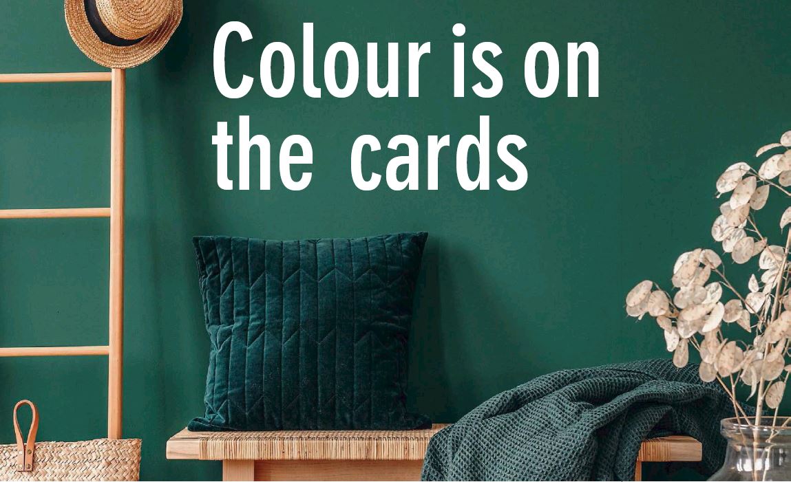
Dulux has opted for a tone called Spiced Honey, playing to the fashion for bringing the colours and feel of nature into the home.It’s not quite as accessible a colour as Dulux normally offers, being just a little bit too closely related to beige for my taste, but used in tandem with teal or and accents of pink and grey it offers something fresh and interesting for spring.
Irish brand Fleetwood is buoyant in its choices for the year ahead. Its colour consultant, and interior designer, Sinéad Cassidy, says, “There’s richness and optimism in colour trends. We’re still seeing grey as a colour to stay, but it’s being challenged by a deep green and indigo blue, accessorised with silver and brass. Pastels are being used as secondary colours, with pink being a good choice to settle the deeper blues and greens.”
Going a little retro, the renaissance of yellow continues into 2019, according to Sinéad.
“It’s being paired with a grey which has a tone of brown. It’s a throwback to the 1930s which makes a good background for tan leather sofas. Taupes and off-whites and earthy tones have emerged, especially if you don’t want to go with deep blues and greens. It’s a refined look with autumnal colours and it looks really good in older homes with classical furniture and a stately fireplace.”
When choosing a paint colour it’s as much to do with your lifestyle as it does with the light and the architecture of your home. If you lead a busy schedule you may like to use calming colours in living areas.
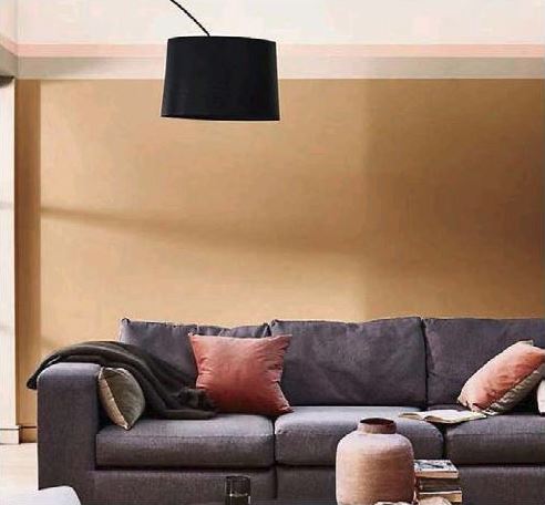
New colour applications have seen a focus on the ceiling which is set to grow over the coming year. Already we’re hearing it called the fifth wall.
“It’s something we haven’t seen for 100 years” says Sinéad. “New builds have higher ceilings nowadays and give the opportunity of bringing in a picture rail and bringing the ceiling colour down to it. If you’re not brave with colour try it out in the downstairs bathroom. It’s an in and out sort of room and doesn’t have to adhere to the rules about light and space. What’s most important is your emotional response to colour. This is what you should go with, not what’s in fashion.”
Meanwhile, Farrow & Ball, noted for its flat, sophisticated tones, has nine new colours trending. Its head of creative matters, Charlotte Cosby, says, “We’re starting to see a shift in favour of bold colours this season.
Neutrals definitely hold a very important place in our colour card, but instead of the ever-so popular greys, we have introduced warmer tones such as muted rose. Green is also a great colour for the home as it brings an element of the outside in.”
Charlotte also cites the new popularity of painted ceilings and has a novel approach. “Switch up the finishes,” she says. “Gloss ceilings create real impact in a room, giving an almost mirror effect to the ceiling. When choosing a paint colour it’s just as much to do with your lifestyle as it does with the light and the architecture of your home. If you lead a busy schedule you may like to use calming colours in the living areas to help unwind and promote relaxation, such as earthy brown-based neutrals. We would recommend testing colours in-situ, to see how the colour choices respond to the changing light in a space, in particular during the times you use the room, and how well they work with the room’s features.”
Spiced Honey, Dulux 2019 Colour of the Year, has a retro look with warm tones which can be paired with accents of grey and dusty pinks for a modern finish (€49.99 for 2.5 ltrs)
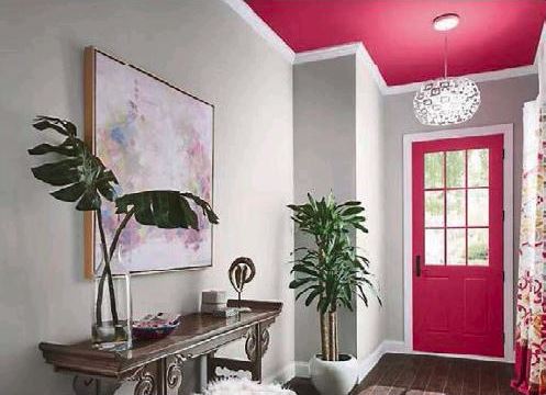
Painted ceilings are a new trend for 2019. The Vogue San Savino pink paint by Fleetwood makes the ceiling a feature, carried through to the door and textiles for a dramatic but cohesive look (from €23.99 for 1 ltr)
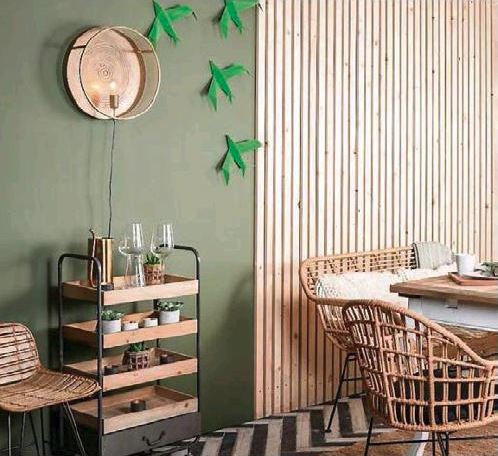
Sweet Caper green by Colortrend adds warmth to an interior and offers a look derived from nature without making a room seem too dark (from €73 for 5 ltrs)