
Read the article at Irish Examiner
In a few days we’ll have the solstice, and before you know it the evenings will be getting longer, offering us the promise of spring and the lovely soft light that comes with it.
The downside, of course, is that this same light shows up all the flaws in our décor, be it white paint yellowed from open fires; patches peeled away by Christmas decorations that were applied with double sided tape, or just the general wear and tear inflicted on the home by a year or more of domestic traffic.
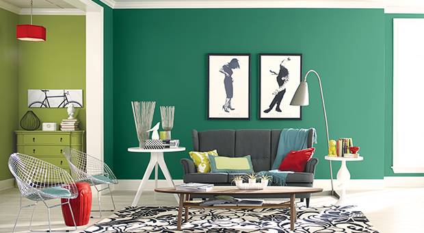
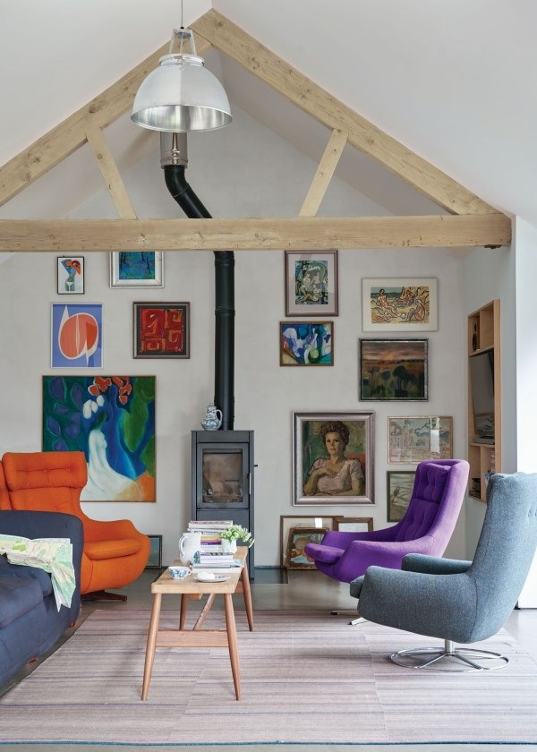
Whether we like it or not, colour continues to trend for 2017, confirmed by colour authority Pantone which has now released its forecasting for the coming year. So abandon the all-white look and indulge your inner psychedelia, even if it’s only on one wall.
Main colours being touted are a departure from 2016, offering a subdued palette inspired by nature. Kale, that deepest of greens, and a wholesome hazelnut brown, along with a spurt of primary colours like yellow and deep blue, have distanced themselves from the controversial saccharine pink and baby blue which Pantone decreed as the colours of last year.
Sinéad Cassidy, colour consultant to Fleetwood Paints, says: “The big buzz words for 2017 are nature and landscape, with earthy forest tones.”
These can be dramatic on their own so Sinéad advises to lighten them up with traditional creams and taupes. “There’s a renaissance in colours of nature — earthy moss green, browns and taupes which you can combine with creams to make a stately, classical look, especially if you add antique brass and contemporary metallics to the look.”
But while styling ideas can look great in a glossy photo, or you’d like to replicate something you saw in a funky restaurant, at home, we can be a tad faint-hearted, especially with eternally problematic rooms where natural light is scarce and we, typically, resort to using a light and airy colour as a resolution.
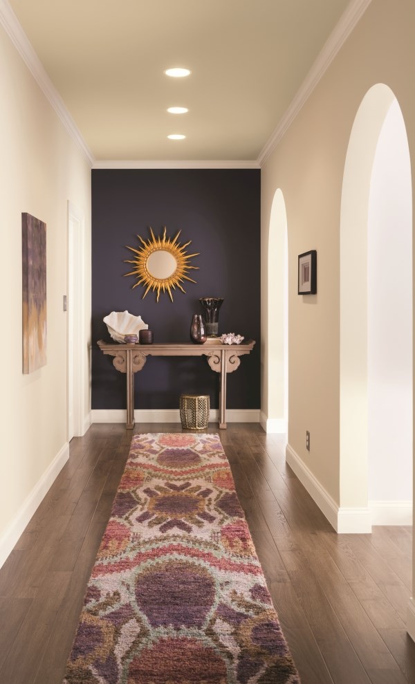
“In a dark house break up the areas,” says Sinéad. “Keep a living area light, and avoid dark colour, so it’s not oppressive. In a hall, dark colour works well for a bit of drama with nice lighting and gilt-edged mirrors.”
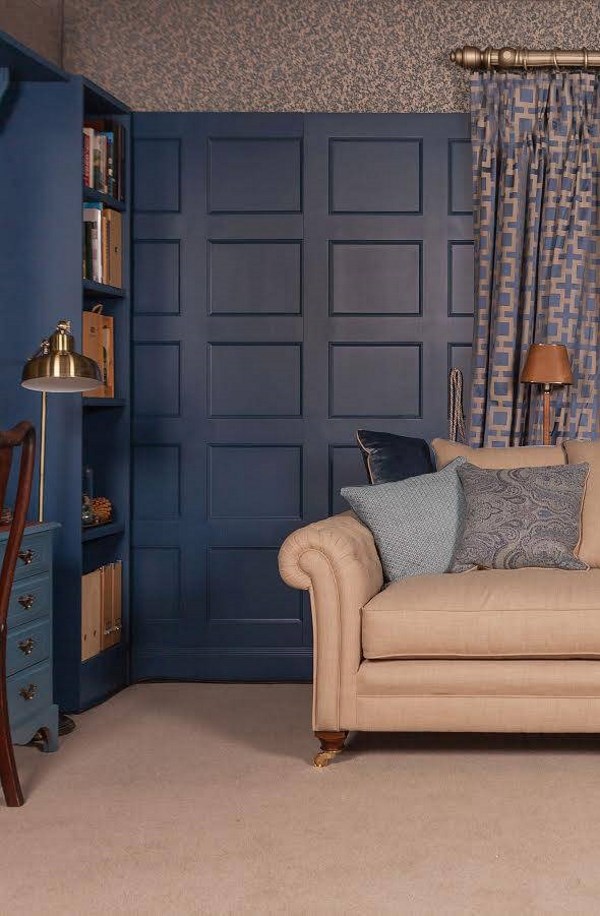
Another option she suggests for introducing colour is the treatment of recessed panelling installed up to dado height. “Use a light colour on the panelling and a darker one on the wall, and use light framed pictures.”
For dramatic effect, she suggests grey, to work as a neutral. “It can settle other colours, like hot pink, and it’s sophisticated and not as stark as black.”
Maura Culbert, colour consultant for Colourtrend, says: “It’s not about what’s in or out, it’s about what works. I look at what will do the most for the room.”
But it’s planning for a decorating project that she maintains is key to the successful use of colour.
“Colour is a comparison,” she explains. “If someone says they want grey, I show them a blue grey and a cream grey. One is drab, the other is warm. Living in Ireland we have enough drab with our weather.
“Keep looking at your colour choice; carry it with you and see what it’s like next to other colours. Gather a piece of floorboard and fabric and see how they all look together and don’t copy your friend down the road.”
Charlotte Crosby, Creative Head at Farrow & Ball, which is famed for its sophisticated paint colour palate, says: “If your room is north facing, colours will tend to appear cooler and harsher, making it difficult to create a feeling of light and space.
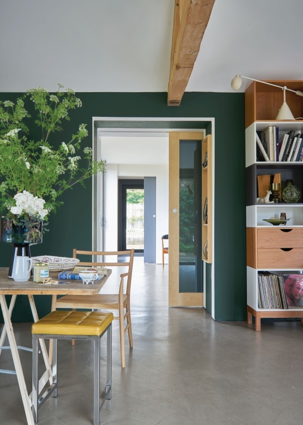
“Don’t fight nature, instead create a dramatic and cocooning interior by using strong colours. Our darkest shade of green is perfect for a cosy country living room.”
No question, southerly aspects are easier to tackle to create an inviting space and to respond well to any colour treatment.
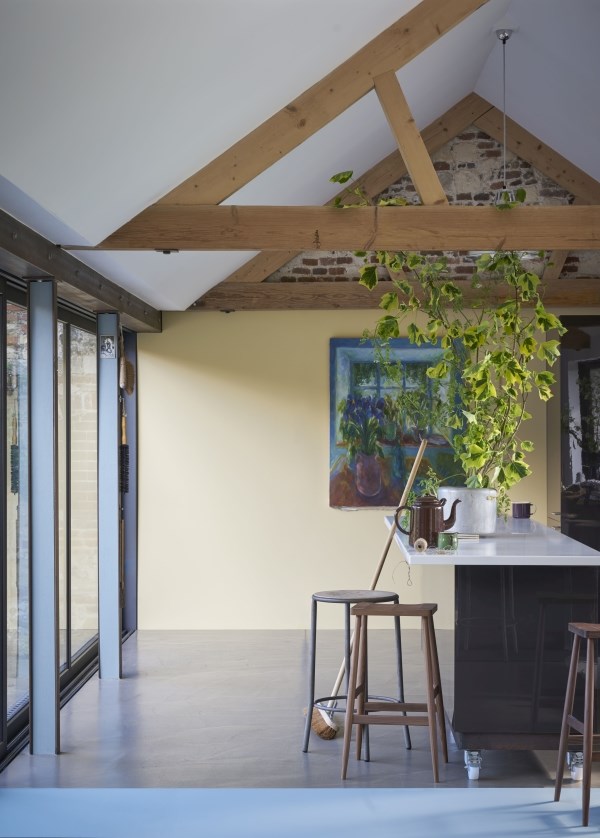
“South-facing rooms are a joy to decorate,” says Charlotte. “They are full of warm light all day, so all colours will look good. We recommend really maximising the feeling of light and space in south facing rooms by choosing pale tones. Soft yellows are best used in rooms with a hushed atmosphere; they offer an aged, whimsical tone making it the perfect colour for a kitchen. Yellow enhances large spaces so beautifully and creates glorious rooms full of energy.”
But just in case you can’t transit from all-white to colour, it is possible to create a lovely space that has nothing to do with chilly minimalism.
“All white has no pigment and creates an uncomplicated feel which is naturally fresh but not stark,” says Charlotte. “The key to this look is to create a mood of stillness and calm by layering different whites, and only whites, together. With their different nuances of colour, they create the perfect backdrop for a room with artwork, as they evoke a complex response when combined in this way.”
She also adds, “Be brave with colour, with something that’s evocative of a happy memory. If you get it wrong, so what; there’s always a solution at the end of the day.”