
Rich shades of yellow, blues and green are in – as is decor inspired by Emily in Paris
With spring now firmly in the air, thanks to the rows of daffodils and crocuses popping up, with it comes the return to the garden and household maintenance.
So if you find you have a spring in your step, painting your home – or at least a room – might be on your mind. But how to pick the perfect colour for your walls?
Joa Studholme, Farrow & Ball’s colour curator, says there will be something “inherently human” in the colours that we use in 2022, as they will herald “a return to normality” for us after two years of the pandemic.
One aspect of this will be a move away from the preferred darker colours of recent trends, such as the brand’s famed Down Pipe, towards a splash of colour, with yellows, blues and greens moving in on the greys of recent years.
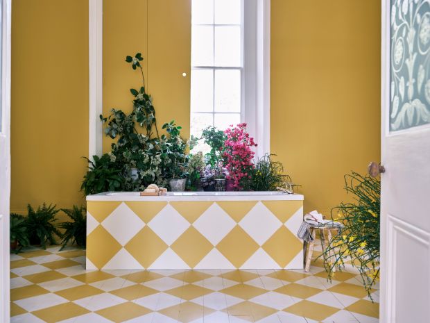
“The cheerful and uncomplicated Babouche is the perfect tone for this task,” she says, adding that the yellow-toned colour, named after the distinctive colour of the leather slippers worn by men in Morocco, brings some sunshine to any room. She suggests it’s combined with the understated School House White.
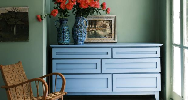
Emma Edmonds, interior designer and colour consultant with Stillorgan Decor, agrees that she’s seeing “a lot more colour this year”, pointing to Dulux’s colour of the year, Bright Skies, as an example. It’s a pale blue that, she says, makes a room feel “airy and bright and opens the space up”.
“People are still painting the house grey, but now we’re selling warmer grey tones,” she says, adding that brighter colours are also making a comeback.
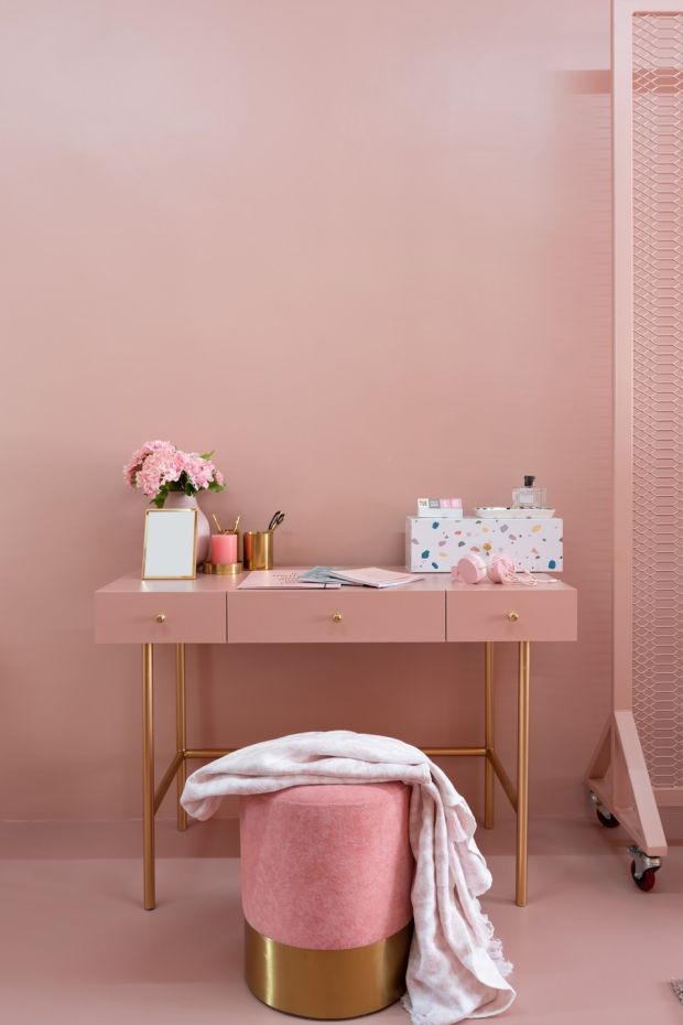
“I couldn’t sell pink 10 years ago. Now we have people coming in asking for it,” she says, adding that people are looking to paint entire rooms in their houses in pink – albeit in more muted shades of the colour.
But there is still a balance.
Fleetwood Pantone’s colour of the year is Very Peri, for example, a vibrant violet colour aimed at bringing out people’s curiosity.
“But we don’t see a lot of people buying it,” says Edmonds, noting that such strong colours might be too much for many people, but adds that she’ll have younger clients painting the inside of their kitchen cabinets in such colours.
Where darker colours are used, they are in keeping with the return-to-nature theme.
Cork interior designer Sinéad Cassidy, who also works as a colour consultant for Fleetwood Paints, says forest tones abound.
“Think Petrus from Fleetwood Popular and Pineneedle from Fleetwood Pantone,” she says.

She also expects to see more of a sort of role reversal, with lighter colours now being used as the accent colour, such as in a dark-tiled bathroom.
Picking the right colour
A temptation in a darker room, such as a hallway or staircase, might be to go for a bright white. However, as Edmonds notes, when it’s very dark, the white won’t actually help, so you should go with a mid-tone colour, such as Farrow & Ball’s Mizzle, a grey-green.
This also means staying away from the favourites of yesteryear.
“I would definitely never recommend Magnolia – although some people still use it,” says Edmonds.
You’ll also have to think about the light in the room. Each aspect needs a different approach to colour, says Cassidy, so north-facing rooms, for example, will need warm undertones, “but they are great places to go for the dramatic deep colours with terrific colour rendering”.
The finish is also important. Matt is the best choice for interior walls, says Cassidy, because “it holds its colour really well and has a rich powdery appearance”. Most brands also now offer a washable option.
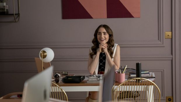
If you’re looking for something similar to the colours used in Emily’s part of the office, try Little Greene’s French Grey or Farrow & Ball’s Peignoir, with its mauvy undertones
And while many of us remember the pain of things sticking to our gloss architraves, it is making a comeback.
“Going gloss can add a touch of glamour and reflects the light well, says Cassidy, adding that you can use it on the lower half of a wall with a matt finish above, which almost acts like a version of panelling.
Before you pick out your testers, Cassidy suggests you stop and think first. Do you want your room to feel calm, relaxed, stylish or cosy?
And don’t paint your tester on the wall. Edmonds suggests you paint a piece of card with the colour, so you can move it around the room to see how it works with your floors, furniture and so on. In addition, a card is easy to bring along with you when shopping for soft furnishings such as curtains and so on.
Ceiling the deal
If your room isn’t particularly large, or you want to add a modern touch, consider “colour drenching”, whereby the same colour is used on both walls and woodwork.
According to Studholme, such a technique can make a room look bigger by disguising the limits of the space. She suggests an estate emulsion finish on the walls, as this shows colours “at their very best as the light changes through the day”.
If you’re feeling very brave, you could go the whole way and paint your ceiling in the same shade too, a la UK designer Abigail Ahern.
Cassidy agrees that doing the ceiling as well could be “the next leap” in 2022.
It’s a look viewers of Netflix’s Emily in Paris might be familiar with, particularly the strong blue used in the meeting room of the traditional office of marketing firm Savoir; indeed Edmonds has had people coming in asking what colours were used. If you’re looking for something similar to the colours used in Emily’s part of the office, try Little Greene’s French Grey or Farrow & Ball’s Peignoir, with its mauvy undertones.
Paint effects
While a trompe-l’œil is a technique too far for most of us, there are easier decorative hacks that can bring out our inner creative spirit while also bringing some fun to our homes.
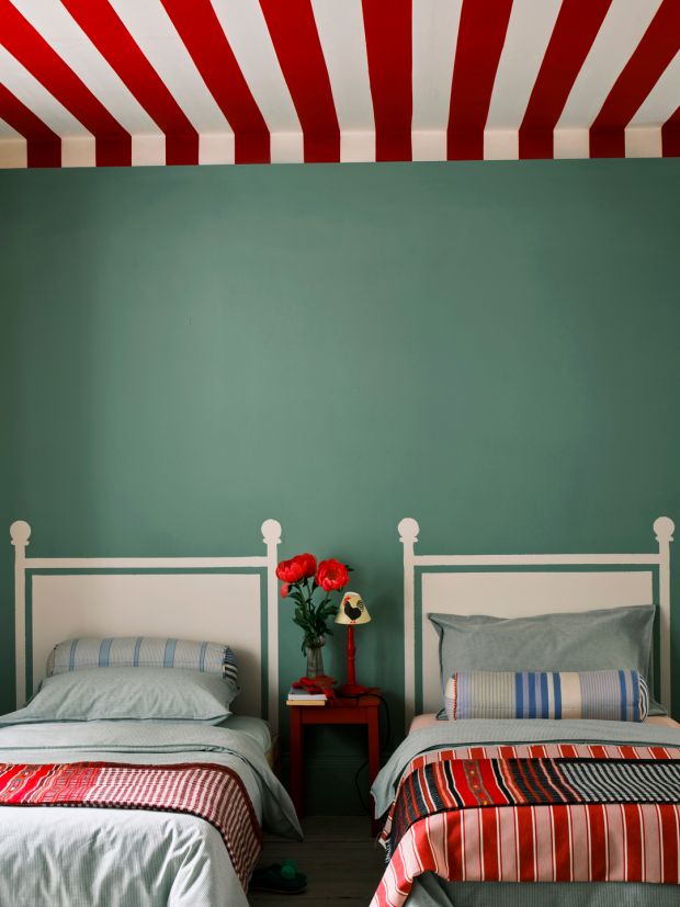
For example, if you’re struggling to find a headboard to fit a certain bed, or the decor of a room, have you ever considered painting one instead?
This is what Farrow & Ball has done in a playful children’s bedroom, by painting a headboard directly on to the wall. Painted in School House White directly on to Breakfast Room Green walls, it creates the illusion of headboards – without the need to source them.
This is paired with a tent-like ceiling effect, painted in thick stripes of Incarnadine and white. In another trick, if you look at the picture again you can see how the ceiling stripes have been brought down on to the walls a short way. This, says Studholme, “creates an intimate tent-like feel and softens the join between wall and ceiling”.
Feature walls remain popular, “but not a 1990s-style big red chimney breast” says Edmonds, adding that they can be effective in larger open-plan areas.
Another popular effect is to paint behind the bed in a tall rectangular shape, the same width as the bed, that stretches across the ceiling, to create a sort of medieval-inspired canopy effect.
Creating diagonal lines is also popular, but can be tricky to achieve, depending on the skill of your painter (which might be yourself).
Cassidy suggests a decor trend to try in 2022 is to add a sleek line above your skirting board to tie in with your colour scheme. “This can create a surprising smart finish,” she says.
When it comes to other features such as arches and split walls, Cassidy says these can be “fun and ideal for kid’s bedrooms”.
But confine them to such spaces. “Their time is up in a living area, as they can be quite distracting and disconcerting,” she advises.
HOW TO GET ADVICE
Before you hand over an arm and a leg buying paint samples, consider talking to the experts first. They can advise on the best colours for certain rooms, and the finish that suits your taste.
To make the most of your consultation, take photos of the relevant rooms, and if meeting in person, bring sample swatches of other materials to be used in the room.
In-person
Pat McDonnell Paints
This chain offers a free in-store colour consultation across its eight stores, including Tralee, Limerick, Galway, Kilkenny and Dublin. A fully refundable deposit applies to each booking. At Dublin’s Nutgrove, the charge is €75, which can be used against the purchase of any paints in store. You can book at mcdonnellpaints.ie
Stillorgan Decor
Interior designer Emma Edmonds offers a free in-store consultation across the range of paints in this store, which includes Dulux, Fleetwood, Little Greene, Colourtrend, Farrow & Ball and so on. The shop also stocks Edmonds’s capsule paint collection with the Finnish brand Tikkurila. Call 01-2884488 to make an appointment.
MRCB
The Dublin 8 shop, which stocks a range of brands including Benjamin Moore and Colourtrend, says it has “no bias to brand”, so can price paints according to your budget. No appointments are necessary for its free 15-minute consultations.
Virtual
If you’re too far from a paint shop, or you appreciate the ease of staying at home, there are also a number of virtual options, which may even allow you to show the consultant your home, through the screen of your computer.
Colourtrend
Irish paint brand Colourtrend offers customers a number of options. For a full Zoom consultation, expect to pay €50, which includes a €25 voucher, redeemable against all products in its online store.
The consultation takes 30 minutes, and afterwards you will get a bespoke colour pack by email.
Another option is a live chat, which is available Monday-Friday, 9am-5pm, through which you can submit questions. colourtrend.ie
Farrow & Ball
The paint brand offers virtual consultancies, ranging from £130 (€156) for one hour, to £260 (€312) for two hours. You can make a booking at farrow-ball.com/colour-consultancy
Fleetwood
You can book an online consultation with Fleetwood for €50. The cost of the session with a Fleetwood interior designer includes three tester pots and a €15 voucher. Book at fleetwood.ie